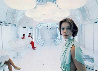
Locations set the mood of a scene just as much as the characters in it, and few locations say so much with so little as those with the Ascetic Aesthetic. Whether a spaceship or a medieval castle, a setting built with an Ascetic Aesthetic is "decorated" in a modern, minimalist and exceedingly clean style. Walls will likely be plain, featureless gray or white, perhaps with a light blue accent. Buildings will have either no curves at all, favoring a blocky and efficient feel, or have oddly sterile "organic" curves. Furniture will likely be plain and industrial, favoring function and comfort over style.
The net feeling these places will evoke is the absence of it. Rooms, buildings and cities will seem cold and empty even when full of people. Though Minimalism as a style can have a lot of character and personality, the Ascetic Aesthetic invokes an uneasy emptiness, be it of life (people are alienated), nature (nothing non-human lives there) or oppression (Dystopia loves this decorative statement).
The most extreme uses of this trope will be just one moving van away from becoming a White Void Room.
This may be justified if it's a hospital or high tech factory where everything has to be clean, but usually goes a little farther in making the set dehumanizingly impersonal. Futuristic settings post Zeerust will usually embrace a form of this trope where Everything Is an iPod In The Future and there are Shiny-Looking Spaceships. Not surprisingly, the polar opposite of this trope is the Used Future, where the edges will be dented, the patina scratched, and the once angelic halogen lights will flicker if they still work at all.
Please note that authors don't always cover every inch of their settings with an Ascetic Aesthetic. It can be localized to just one room as easily as a planet. For this reason, stories that feature a place with an Ascetic Aesthetic will often be contrasted at one or more points with at least one homey, hearthy, or all-natural location, where the characters who are closer to Earth dwell. If two factions embrace these opposite aesthetic and philosophical views, expect Slobs Versus Snobs.
Another uses for this design aesthetic is that it doesn't distract viewers as much as homier or "busier" sets like the Bazaar of the Bizarre, turning the focus on characters and any significant decoration or out of place element. Like a flower pot, pet cat, dropped MacGuffin or blood covered wall. Because when something is out of place or has Gone Horribly Wrong in these locations, it's very easy to tell.
In the shiny end of Sliding Scale of Shiny Versus Gritty.
Contrast/See also Design Student's Orgasm.
Anime and Manga[]
- In Saint Beast, Zeus' shrine and Heaven's Palace are opulent for their sheer size but there's very little filling the space and the dominant colour is white.
Film[]
- Jacques Tati's Playtime.
- This was the standard design aesthetic for science fiction until Star Wars hit the scene. Chronologically, it is likely the first aversion in film with Star Wars: A New Hope, which debuted in 1977. Two years later, Alien averted the trope yet further, as the starships were gritty and grimy, just as you should expect a giant long-haul vehicle that is its own repair garage would be in space. Less "sports car," more "Australian outback 4WD". Tales of Future Past has pages of examples.
- Star Wars actually uses it to good effect to contrast the clean, dark and minimalist Imperial Star Destroyers with the dirty and homey Millennium Falcon. Also semi-averted in Episode 2 with the Kaminoan homeworld: the Kaminoan buildings look like they have a white minimalistic appearance, but the Kaminoans' vision is mostly in a spectrum that humans can't see, so all their artwork and painting is in ultraviolet.
- Cloud City follows this trope to a 'T' with it's interior decoration dominated by the use of white.
- Tron, which is perhaps justified by The Grid being a computer world where everything would have had to be programmed in.
- Taken Up to Eleven in the sequel.
- San Angeles gives off this vibe in Demolition Man.
- The Heart of Gold in the Hitch Hikers Guide to The Galaxy Film.
- Miranda in Serenity. Also shown with the scenes from the Academy at the beginning of the movie, and on the Alliance ships in the series proper, which were designed to look sterile and colorless with both architecture and uniform.
- Dulock in Shrek.
- The monster holding facility in Monsters vs. Aliens, coupled with Unnecessarily Large Interior. And no, that little bitty "Hang In There" poster doesn't perk things up any.
- Patrick Bateman's Apartment in American Psycho.
- In Logan's Run, the dome city is decorated on these lines. In reality, much of it was filmed at the Dallas Market Center
- In Richard Lester's 1965 youth comedy The Knack, Tom, who is a bit mad, moves into the townhouse advertising for a tenant (without notifying the landlord first) and immediately empties out all the furniture and paints it completely white - floors, windowpanes and all.
- The Sarang moon base in Moon has white, geometrical atmosphere that emphasizes the loneliness felt by the protagonist. It is a bit dirtier than the typical example, though.
- The time travel chamber in Guest From the Future is a white room with a control stand in the center, and the Time Institute is made of polished metal panels.
- Equilibrium uses this to show the difference between the clean, calm, boring, and unemotional society and the dirty, downtrodden and emotional heretics.
- Despicable Me shows Gru as a down to earth, but homey in a kind of way villain, whereas Vector is shown as being a villain that looks like he purchased all his furniture from Steve Jobs. He also plays a Nintendo Wii, which features the same aesthetic.
- Aside from the "Dawn of Man" segment, 2001: A Space Odyssey practically defines this trope.
Literature[]
- The SubUrbs in John Ringo's Aldenatta-verse start out this way, but very quickly become Used Future.
Live-Action TV[]
- In Battlestar Galactica, the colonials and Cylons have very different design aesthetics, with the former being in a run-down warship, with even the newer ships (ala Pegasus) are distinctly utilitarian; the latter in ultra-modern organic/technological starships.
- The Starship Enterprise looks like it was designed by Future Ikea, because it's always clean and sterile.
- This actually works to exalt the small touches that characters add to their personal spaces. Picard has an exotic fish in his office, and Data has Spot the cat.
- One interesting detail though that the set designers added was the curved wooden oval with the tactical station on the bridge. It is probably the only time in Star Trek we see a Federation ship with natural materials featuring prominently in the design. In interviews they mention it was to add a "homey" touch that also reinforced the "cruise ship in space" feel. Some of the concept sketches for the Next Gen Enterprise included hanging plants on the bridge.
- And indeed, in the show itself, a captain of another (smaller, older) Starfleet vessel refers to the Enterprise as a "Flying Hotel".
- The TARDIS from Doctor Who, particularly in its original 1960s incarnation before the production team decided to retcon the reason for the Doctor not being able to fly it properly from his not knowing how to the TARDIS being obsolete and knackered. Attempts by some designers to update the look of the TARDIS to make it look consciously futuristic (most infamously in the 1980s) have, ironically, dated faster. Latterly the TARDIS set design has moved away from asceticism to embrace steampunk and clapped-out organo-gothic, with decidedly mixed results.
- Massive Dynamic from Fringe is in love with this style, combined with Sinister Geometry.
Music[]
- The video for Bjork's All Is Full Of Love features spotless white rooms and robots.
Tabletop RPGs[]
- Magic: The Gathering offers various examples of this. The perfect metallic plane of Phyrexia and, later, in Alara there are the Sphinxes and the neatly polished Etherium.
Videogames[]
- The Nano Age buildings in Empire Earth are all stylish and predominantly white.
- The Citadel in Mass Effect.
- ME2 worked a lot to subvert this trope. The Wards (parts of the Citadel where normal people live) are much more crowded and dirty than the pristine Embassy section. Omega takes it Up to Eleven, practically passing for a Blade Runner set, all to make the sequel Darker and Edgier.
- The test chambers in Portal, to some extent. The offices backstage also use this style.
- Most of the public spaces in Mirror's Edge are this way, albeit with bright colours to offset the white, everything's so clinical in its cleanliness that it quite effectively drives home how oppressive the regime truly is.
- In keeping with its anime style, Oni did this. In an inversion of Artists Are Not Architects, the level design done by actual architects was commonly slagged by players as excessively bland.
- Kingdom Hearts locations The Castle That Never Was as well as Castle Oblivion utilize this aesthetic, as does Naminé's room in the Twilight Town mansion, accordingly.
- In Final Fantasy XIII, the final part of Orphan's Cradle, immediately prior to the Final Boss, is a stylish, clean white room that looks eerily like a lobby or waiting room. Unsettling, especially considering the surreal alternate dimension previously traversed to get to that point.
- The entirety of the world in the indie game Against The Wall, which is "set on the side of an infinite brick wall". Don't look down.
- The Yi-Lono-Mordel Control Room of the Interactive Fiction game The Weapon is described as this.
Web Comics[]
- Last Res0rt is pretty clean and sterile to begin with, but Gabriel's ship, the White Diamond Crisis, is especially so even by the comic's standards. It goes for shades of mint/teal and lavender rather than pure white, though.
Western Animation[]
- In that SpongeBob SquarePants episode where Squidward goes to the future, he discovers that everything in the future is chrome: literally. A flower pops out of the ground and a truck shows up to spray it with chrome. The overall effect gets creepy after a while.
- Providence from Generator Rex love this trope and wish to marry it. It provides a good visual contrast with their freakish biological enemies, the EVOs.
- Detroit Deluxe in Motorcity is all white and glass and rounded corners, but the sleek environment belies the Big Bad's iron grip on the people.
- Mandark's laboratory was this before it was turned into an Obviously Evil design.
Real Life[]
- Bauhaus architecture, the style's name was coined by one of its most famous proponents, German architect Walter Gropius. Frank Lloyd Wright hated the aesthetic and accused it of lacking a soul.
- Hospitals, and with good reason.
- Hospital bedrooms and such, anyway. Hallways and such that dont need strict cleanliness can be more decorative, aparently.
- The Wii and the Wii Menu, right down to the white-and-cyan scheme.
- The living areas for many a military recruit or cadet, due to The Spartan Way being adopted to varying degrees. Indeed, "Spartan" is another word used to sometimes describe the minimalist nature of this asthetic.
- Spartan is vastly different in that the point isn't blank and soulless, it's function over form and comfort. You don't actually need a bed to sleep, a designated corner technically works just as fine, you don't need bay windows, but having holes big enough to see what's going on outside could give you vital information you can use to influence your next action, etc.
- Apple Corporation started using this as its main design asthetic from the late 1990s and onward.
- Japanese Zen practitioners have had this aesthetic mastered for centuries; so much, that it's nearly a cliché to imagine Japanese rooms as mostly empty, with possibly a wall scroll or a nude branch of a tree artistically propped up at an angle as the sole decoration.
- Many an office or classroom uses this, so much so that employees decorate their cubicals to offset the maddening blandness.